Quick Guide to Barcode Colors
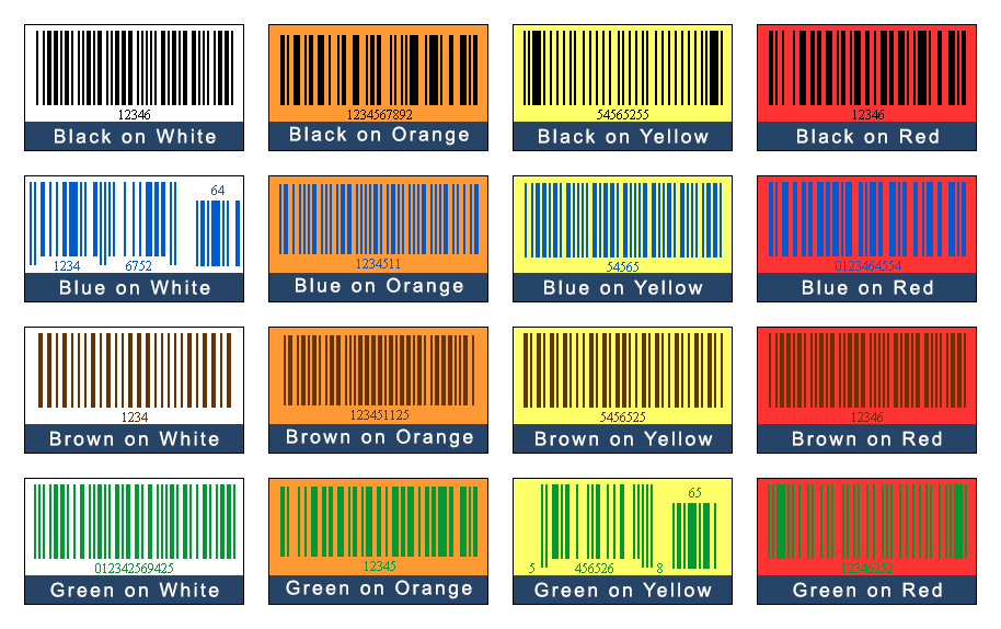
The right color combination is very necessary to design a perfect barcode label. These colors are essential for the proper readability of the barcode. There are some color combinations that are inappropriate for the scanning because they don’t offer enough contrast between the light background and the dark bars. Let’s see which colors are suitable for your barcode and which colors you should avoid while designing a barcode label.
How to Select the Best Color Combination for the Barcode Labels?
You must consider the barcode scanner, barcode spacing, and contrast while deciding on the colors for your barcode labels. The scanner reads the barcodes more easily when their background reflects the light but bars don’t reflect the same. Yellow, red, or any light-colored bars are difficult for the scanners to detect so, it is highly recommended that the dark colors should be used for the bars and light colors for the background.
Good Barcode Color Combinations
The most common and the best color combination is black bars on a white background because white and black color provides a high level of contrast that makes it easier for the barcode reader to scan the barcode label.
A good barcode color combination includes the bars that are black, blue, green, or brown and backgrounds that are white, red, orange or yellow because these combinations provide sufficient contrast between the bars and the background and make it easy for the scanner to scan the bars.

Bad Barcode Color Combinations

The worst color combination of a barcode label is light bars on a light background (yellow on white) or dark bars on a dark background (black on brown) because this combination offers a very poor level of contrast due to which the scanner becomes unable to read the barcode.

Scanners use red-colored lasers to read the barcode. When it read the barcode (with red bars on white background), then the red color of the bars appears as a white color it will only detect an empty white area. Similiarly in the case of green color, the barcode scanner reads green as a black in color because both red and green colors are opposite to each other.

Metallic colored bars on a plain background or plain bars on a metallic colored background, both are bad combinations because these shiny metallic colors reflect the light away from the scanner.

Patterned Backgrounds are also a bad choice for a barcode label. The same is true for transparent surfaces that could reduce contrast by allowing the package contents to shine throughout the barcode.
Design Barcodes in Different Colors by using Barcode Generator Software
Create different varieties of 1d and 2d barcodes with the help of a barcode labeling application. Design bulk barcodes with different color combinations and print them on a single sheet of paper simultaneously. This software is designed for all types of users, beginners as well as professionals. You can learn to create barcode labels by clicking on the below link.
Some Key Points to Remember While Designing Barcodes with the Right Color Combinations
- The spaces should always be lighter than the bars. Inverted barcodes (white bars on black background) cannot be read by scanners.
- The barcode background should be white or a warm color (yellow or red) since these colors are invisible to barcode scanners.
- The bar codes must be surrounded by thin margins (referred to as a quiet zone). They must never be disrupted.