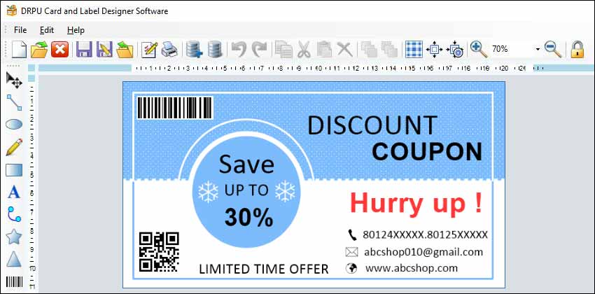
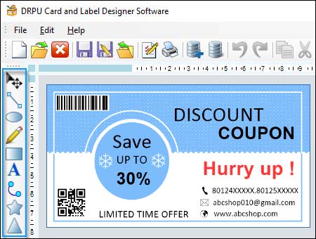
Use the Different Design Elements
Design elements such as images, text, and colors are crucial components in creating an effective label design. Label designer software provides a range of tools and features that allow designers to incorporate these elements effectively. In this article, we will explore how to use these design elements effectively in label designer software.
-
01 Images:
Images are one of the most important design elements in label design. They can help convey the product's message and make the label more appealing to consumers. Here are some tips on using images effectively in label designer software:
Use High-Quality Images: High-quality images are essential to creating a professional-looking label design. When using images in your label design, make sure to use high-resolution images that are appropriate for the printing method and size of the label.
Use Images that Relate to the Product: When choosing images for your label design, make sure that they relate to the product. The images should reflect the product's features and benefits and help convey the product's message.
Use Images that Stand Out: Choose images that are eye-catching and attention-grabbing. The images should be able to capture the consumer's attention and stand out on the shelf.
Use Images that are Relevant to the Target Audience: When choosing images for your label design, consider your target audience. The images should be relevant to their interests and preferences and should appeal to them.
-
02 Text:
Text is another important design element in label design. It can help communicate information about the product and create a brand identity. Here are some tips on using text effectively in label designer software:
Use Readable Fonts: Choose fonts that are easy to read and are appropriate for the product and brand. Avoid using fonts that are too small or too complex as they can be difficult to read.
Use Concise and Clear Messaging: The text on the label should be concise and clear. It should convey important information about the product, such as the product name, ingredients, and usage instructions.
Use Typography to Create Hierarchy: Use typography to create a hierarchy of information on the label. The most important information should be larger and more prominent, while secondary information should be smaller and less prominent.
Use Color to Enhance the Text: Use color to enhance the text and create visual interest. Choose colors that are appropriate for the product and brand and that are visually appealing.
-
Download and Install
Label Design Software -
03 Colors:
Colors are a critical design element in label design. They can create an emotional connection with the consumer and help differentiate the product from competitors. Here are some tips on using colors effectively in label designer software:
Use Colors that Reflect the Product and Brand: Choose colors that reflect the product's features and benefits and that are appropriate for the brand. The colors should be consistent with the brand's identity and personality.
Use Color to Create Contrast: Use color to create contrast and make the label more visually appealing. Choose colors that contrast with each other and that create a sense of balance and harmony.
Use Color to Create Hierarchy: Use color to create a hierarchy of information on the label. The most important information should be highlighted with a more prominent color, while secondary information should be less prominent.
Use Color to Evoke Emotion: Use color to evoke emotion and create an emotional connection with the consumer. Different colors can evoke different emotions, so choose colors that are appropriate for the product and brand.
Make Sure Your Label Designs are Accessible for All Users
When creating label designs, it's essential to ensure that they are accessible to all users, including those with disabilities. Accessibility means designing products that can be used by people with disabilities, such as visual impairments, hearing impairments, and motor impairments. Some best practices for making label designs accessible when using label designer software:-
-
Use High-Contrast Colors
Using high-contrast colors is one of the best practices for making label designs accessible. High-contrast colors make it easier for users with visual impairments to read the text and images on the label. When choosing colors for a label design, it's important to consider the contrast between the text and the background. The contrast ratio should be at least 4.5:1 for normal text and 3:1 for large text.
Label designer software often comes with built-in color palettes or the ability to customize colors. When designing a label, it's important to choose colors that provide enough contrast and to test the contrast ratio using a tool like the WebAIM Color Contrast Checker.
-
Use Clear and Simple Language
Using clear and simple language is another best practice for making label designs accessible. Clear and simple language makes it easier for users with cognitive or language disabilities to understand the label. When writing the text for a label, it's important to use plain language that is easy to understand.
Label designer software often comes with built-in text tools or the ability to import text from other sources. When writing the text for a label, it's important to use short sentences, simple words, and active voice. It's also important to avoid using jargon, technical terms, or acronyms that users may not understand.
-
Provide Alternative Text Descriptions
Providing alternative text descriptions is another best practice for making label designs accessible. Alternative text descriptions, also known as alt text, are short descriptions that provide information about an image or graphic on a label. Users with visual impairments rely on alt text to understand the content of the label.
Label designer software often includes the ability to add alt text to images or graphics. When adding alt text, it's important to provide a short and descriptive summary of the image or graphic. The alt text should be specific and provide enough information for users to understand the content of the label.
-
Ensure Keyboard Accessibility
Ensuring keyboard accessibility is another best practice for making label designs accessible. Keyboard accessibility means designing the label so that it can be navigated using a keyboard alone. Users with motor impairments or who cannot use a mouse rely on keyboard navigation to access the content of the label.
Label designer software often includes the ability to customize the keyboard navigation of the label. When designing the keyboard navigation, it's important to ensure that all the content on the label can be accessed using the keyboard. Users should be able to navigate the label using the Tab key and activate links or buttons using the Enter key.
-
Provide Captions and Transcripts
Providing captions and transcripts is another best practice for making label designs accessible. Captions and transcripts provide a text-based alternative to video or audio content on the label. Users with hearing impairments or who cannot play video or audio content rely on captions and transcripts to access the content of the label.
Label designer software often includes the ability to add captions or transcripts to video or audio content on the label. When creating captions or transcripts, it's important to ensure that they provide an accurate and complete summary of the video or audio content. The captions or transcripts should be synchronized with the video or audio content to provide a seamless user experience.
Creating Consistent Label Designs Across Different Devices and Platforms
Creating consistent label designs across different devices and platforms can be a challenging task. With the proliferation of devices and platforms, it is becoming increasingly important for designers to ensure that their label designs look consistent and professional on all devices and platforms. Some of the best practices for creating consistent label designs using label designer software.

-
Start With a Design
System:
One of the best practices for creating consistent label designs is to start with a design system. A design system is a set of guidelines, principles, and assets that define the look and feel of a product or brand. A design system can help ensure that all label designs are consistent, no matter who is working on them or which device or platform they are being viewed on.
A design system should include:⬗ Brand guidelines that define the brand's colors, typography, imagery, and overall style
⬗ Component libraries that contain pre-built components such as buttons, icons, and forms
⬗ Templates that provide a consistent layout and structure for different types of labels
⬗ By starting with a design system, designers can ensure that all label designs are consistent and aligned with the brand's identity.
-
Use Responsive Design:
Responsive design is another best practice for creating consistent label designs. Responsive design is a design approach that allows websites and applications to adapt to different screen sizes and resolutions. In label design, responsive design means designing labels that can be scaled up or down without losing their quality or legibility.
When designing labels, it is essential to consider the different screen sizes and resolutions that they will be viewed on. A label that looks great on a desktop computer may not look as good on a mobile device or tablet. Using responsive design techniques such as flexible grids, fluid images, and media queries can help ensure that labels look consistent and professional on all devices.
-
Consider Accessibility:
Accessibility is an essential consideration when designing labels. Accessibility means designing products that are usable by people with disabilities, such as visual impairments, hearing impairments, and motor impairments. Designers can ensure accessibility by following the Web Content Accessibility Guidelines (WCAG) 2.0 or 2.1.
Some best practices for creating accessible label designs include:⬗ Use high-contrast colors to make the text and images more readable
⬗ Use clear and simple language that is easy to understand
⬗ Provide alternative text descriptions for images and graphics
⬗ Ensure that the labels can be navigated using a keyboard
⬗ Provide captions and transcripts for videos and audio files
⬗ By considering accessibility when designing labels, designers can ensure that their labels are usable by everyone, regardless of their abilities.
-
Test on Multiple
Devices and Platforms:
Finally, one of the best practices for creating consistent label designs is to test the labels on multiple devices and platforms. Different devices and platforms can display labels differently, and it is essential to ensure that the labels look consistent and professional on all of them.
Some best practices for testing label designs on multiple devices and platforms include:⬗ Test the labels on multiple devices such as desktops, laptops, tablets, and smartphones
⬗ Test the labels on multiple platforms such as Windows, MacOS, iOS, and Android
⬗ Use tools such as BrowserStack or Sauce Labs to test the labels on different browsers and operating systems
⬗ Use virtual machines to test the labels on older versions of operating systems and browsers
⬗ By testing label designs on multiple devices and platforms, designers can ensure that their labels look consistent and professional on all of them.
Conclusion: Creating consistent label designs across different devices and platforms requires a combination of best practices and techniques. By starting with a design system, using responsive design, considering accessibility, and testing on multiple devices and platforms, designers can ensure that their label designs look consistent and professional, no matter where or how they are viewed.
 DOWNLOAD