Common File Formats for Label Designs
There are several file formats available for label designs, and the choice of file format depends on the requirements of the design and the intended use of the label. The following are some of the most common file formats used for label designs:
PDF is a widely used file format that is compatible with most operating systems and printing equipment. It is a popular choice for label designs as it preserves the original formatting of the design and can be easily shared with others.
EPS is a vector-based file format that is used for high-quality printing. It is compatible with most printing equipment and can be resized without losing quality. EPS is a popular choice for label designs that require high-resolution printing.
SVG is a vector-based file format that is used for web graphics and digital printing. It is compatible with most printing equipment and can be resized without losing quality.
AI is a vector-based file format that is widely used by graphic designers. It is compatible with most printing equipment and can be easily edited using Adobe Illustrator software.
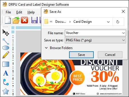
PNG is a raster-based file format that is used for web graphics and digital printing. It supports transparency and is commonly used for label designs that include images.
Ensuring Compatibility with Different Printing Methods and Equipment
When designing labels, it is important to ensure that the file format used is compatible with the printing method and equipment used. The following are some tips to ensure compatibility:
-
Check the Printing
Requirements:
Before designing the label, it is important to check the printing requirements of the printing equipment. This includes the color mode, resolution, and file format. This will ensure that the label design is compatible with the printing equipment.
-
Use Vector-Based File
Formats:
Vector-based file formats like EPS and AI are preferred for label designs as they can be easily scaled without losing quality. This is important when designing labels that need to be printed in different sizes.
-
Use the Correct Color Mode:
It is important to use the correct color mode when designing labels. CMYK (Cyan, Magenta, Yellow, Black) is the standard color mode for printing, while RGB (Red, Green, Blue) is used for digital graphics. Using the wrong color mode can result in color distortion and poor print quality.
-
Use High-Resolution Images:
When using images in label designs, it is important to use high-resolution images. This will ensure that the images appear sharp and clear when printed.
-
Embed Fonts:
When designing labels, it is important to embed the fonts used in the design. This will ensure that the correct font is used when the label is printed.
-
Proofread the Label Design:
Before printing the label, it is important to proofread the label design to ensure that all text and graphics are correctly aligned and spelled correctly.
Conclusion: Choosing the right file format for label designs is crucial to ensure compatibility with different printing methods and equipment. PDF, EPS, AI, PNG, and SVG are some of the most common file formats used for label designs. It is important to check the printing requirements of the printing equipment, use vector-based file formats, use the correct color mode, use high-resolution images, embed fonts, and proofread the label design to ensure compatibility and the best possible print quality.
Different Design Elements in Label Designer Software
Designing a label is a complex task that requires careful consideration of various design elements, including images, text, and colors. Each element plays a critical role in creating a label that is not only visually appealing but also communicates the intended message to the target audience effectively. Ways of using different design elements, such as images, text, and colors, effectively in label designer software:-

Images are an essential design element in label design as they help to communicate the product’s message and evoke emotions in the target audience. Here are some tips on how to use images effectively in label designer software:
a Choose the Right Image: The image you choose should be relevant to the product you are selling. For instance, if you are designing a label for a food product, it should have an image of the food item or its ingredients. Also, make sure that the image is high-quality and has the right resolution to avoid pixelation.
b Use Colors that Complement the Image: The colors you use in your label should complement the image you have chosen. If the image has a dominant color, try to incorporate that color into your label’s design.
c Avoid Clutter: Do not clutter your label with too many images. A cluttered label can be overwhelming and confusing to the target audience.
Text is another critical design element in label design, as it helps to communicate essential information about the product. Here are some tips on how to use text effectively in label designer software:
a Choose the Right Font: The font you choose should be easy to read and complement your label’s design. Avoid using too many fonts as it can make your label look cluttered.
b Use Hierarchy: Use hierarchy to ensure that the essential information is highlighted. Use different font sizes, colors, and styles to create a hierarchy of information.
c Keep it Concise: Keep your text concise and to the point. Avoid using too many words as it can make your label look cluttered.
Colors play a crucial role in label design as they help to evoke emotions in the target audience and communicate the product’s message. Here are some tips on how to use colors effectively in label designer software:
a Understand Color Psychology: Different colors evoke different emotions in people. For instance, red is associated with excitement and passion, while blue is associated with calmness and trust. Understand the psychology behind colors and use them to your advantage.
b Use a Limited Color Palette: Using too many colors in your label can make it look cluttered and confusing. Stick to a limited color palette to ensure that your label looks clean and professional.
c Use Contrast: Use contrast to make your label stand out. For instance, if you have a light background, use dark text to create contrast.
Conclusion: Designing a label is a complex task that requires careful consideration of various design elements. When using label designer software, it is important to choose the right images, use text effectively, and use colors that complement your label’s design. By following these tips, you can create a label that is not only visually appealing but also communicates the intended message to the target audience effectively.
Best Practices for Creating Consistent Label Designs
Creating consistent label designs across different devices and platforms is essential for a successful branding strategy. With so many devices and platforms available today, including desktop computers, laptops, tablets, and smartphones, it can be a challenge to ensure that your labels look the same across all of them. Some best practices for creating consistent label designs using label designer software.

-
Keep it Simple
When designing labels, it's important to keep things simple. Avoid cluttering your labels with too many design elements, as this can make them difficult to read and understand. Stick to a simple, clean design that highlights your brand and product information.
-
Test Your Labels on
Different Devices and Platforms
Before finalizing your label designs, it's important to test them on different devices and platforms. This will ensure that your labels look the same across all devices and platforms. If you notice any issues, make the necessary adjustments to your label designs.
-
Keep Your Branding
Consistent
Finally, it's important to keep your branding consistent across all of your label designs. This means using the same logo, color palette, typography, and other design elements across all of your labels. Consistency is key to creating a strong brand identity that resonates with your customers.
-
Stick to a Consistent
Typography
In addition to using a consistent color palette, it's important to stick to a consistent typography. Choose a font family that aligns with your brand and use it consistently throughout your label designs. This will help to create a consistent look and feel across all of your labels.
-
Consider the Device and
Platform
Consider the device and platform that your labels will be viewed on. Different devices and platforms have different screen sizes and resolutions, which can affect how your labels look. Make sure that your label designs are optimized for the device and platform they will be viewed on.
-
Consider Accessibility
When designing labels, it's important to consider accessibility. This means making sure that your labels are easy to read and understand for people with visual impairments. Use a font size that is easy to read, and make sure that there is enough contrast between the text and background colors.
-
Use a Consistent Color
Palette
Using a consistent color palette is important for maintaining consistency across different devices and platforms. Choose a color palette that aligns with your brand and use it consistently throughout your label designs. This will ensure that your labels look the same, regardless of the device or platform they are viewed on.
-
Use High-Quality Images
When incorporating images into your label designs, it's important to use high-quality images. Low-quality images can appear pixelated or blurry, which can detract from the overall look and feel of your labels. Use high-resolution images that are optimized for the device and platform they will be viewed on.
-
Choose the Right Label
Designer Software
The first step in creating consistent label designs is choosing the right label designer software. You need software that is compatible with all devices and platforms you will be using. Make sure that the software you choose has the necessary features and tools to create the type of label designs you want. Additionally, make sure the software allows for cross-device and cross-platform collaboration and sharing.
-
Use Vector Graphics
When designing labels, it's important to use vector graphics instead of raster graphics. Vector graphics are resolution-independent, which means that they will look the same regardless of the device or platform they are viewed on. Raster graphics, on the other hand, can appear pixelated or blurry form when viewed on a device with a different resolutions.
Conclusion: Creating consistent label designs across different devices and platforms is essential for a successful branding strategy and that can be done by choosing the right label designer software, using a consistent color palette and typography, keeping things simple, considering the device and platform, using vector graphics etc.
