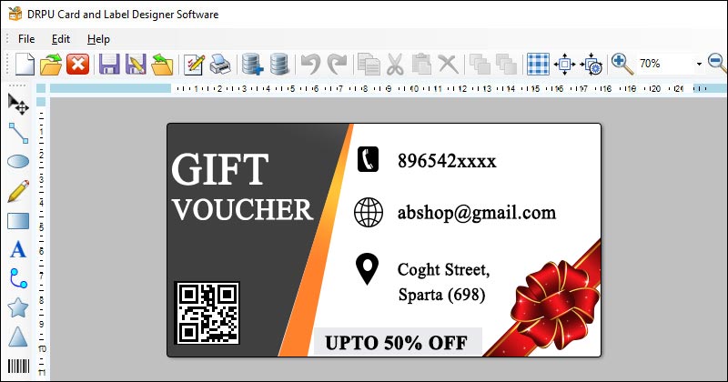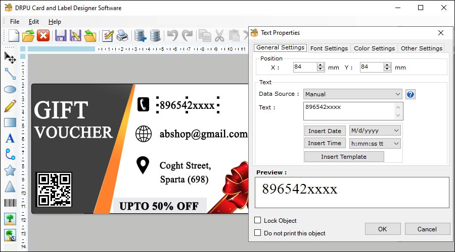
Some best practices for creating consistent label designs across different devices and platforms using label designer software:-
-
Use Vector Graphics
Vector graphics are scalable and resolution-independent, which means they can be scaled up or down without losing quality. This makes them ideal for creating designs that need to be displayed on different devices and platforms. When using label designer software, it's important to use vector graphics for all design elements, including logos, icons, and text. This will ensure that the design looks crisp and clear on all devices, regardless of the resolution or screen size.
-
Use Web-Safe Fonts
Fonts can be a major source of inconsistency when creating label designs across different devices and platforms. Not all devices and platforms support the same fonts, which means that a font that looks great on one device may not look as good on another. To avoid this problem, it's best to use web-safe fonts when designing labels. Web-safe fonts are fonts that are available on all devices and platforms and are designed to look good on screens.
-
Choose a Simple Color Palette
Colors can also be a source of inconsistency when designing labels across different devices and platforms. To create a consistent design, it's best to choose a simple color palette that is easy to reproduce on all devices and platforms. This means using colors that are widely supported, such as black, white, and primary colors. Avoid using shades or tints of colors, as these can look different on different devices and platforms.
-
Follow Design Guidelines
Different devices and platforms have their own design guidelines, which can affect how your label designs look. To ensure that your designs look consistent across all devices and platforms, it's important to follow the design guidelines for each platform. For example, if you're designing labels for iOS devices, you should follow the iOS design guidelines to ensure that your designs look consistent with other iOS apps.
-
Test on Multiple Devices and Platforms
To ensure that your label designs look consistent on all devices and platforms, it's important to test them on multiple devices and platforms. This will give you a better understanding of how the design looks on different screens, resolutions, and platforms. If you notice any inconsistencies or issues, you can make adjustments to the design to ensure that it looks good on all devices and platforms.
-
Keep it Simple
Finally, one of the best practices for creating consistent label designs across different devices and platforms is to keep it simple. Simple designs are easier to reproduce on different devices and platforms and are less likely to look different. Avoid using complex designs that rely on a lot of detail or subtle shading, as these can be difficult to reproduce on different devices and platforms.
Make Sure Your Label Designs are Accessible for All Users
Creating label designs that are accessible for all users is a crucial aspect of designing any type of product. Here are some essential steps that label designer software should take to ensure that their label designs are accessible to everyone, regardless of any disabilities or limitations they may have:-
-
Use High-Contrast Colors: The first step in creating accessible label designs is to ensure that they use high-contrast colors. High-contrast color schemes make it easier for users with low vision or color blindness to read the labels. Generally, labels with black text on a white background, or white text on a black background, are considered to be the most accessible.
-
Choose Readable Fonts: Selecting a readable font is another essential aspect of creating accessible label designs. Fonts that are easy to read and don't have complicated shapes, are generally the most accessible. Some of the most popular and accessible fonts include Arial, Verdana, and Times New Roman. Additionally, designers should avoid using fonts that are too small or too decorative, as they may be challenging to read for some users.
-
Use Large Text: Using large text sizes is crucial when designing accessible labels. Large text sizes make it easier for users with low vision to read the labels. Designers should aim to use a font size of at least 14 points, and preferably, they should go for 16-18 points for optimal accessibility.
-
Provide Enough Contrast: Another important aspect of designing accessible labels is to ensure that there is enough contrast between the text and the background color. The contrast ratio between the two should be at least 4.5:1 for normal text and 3:1 for large text (18pt or larger). Designers can use tools like WebAIM’s Contrast Checker to ensure that the contrast ratio meets the minimum accessibility standards.
-
Use Descriptive Labels: Using descriptive labels is crucial when designing accessible labels. Descriptive labels provide users with a clear understanding of what the label content is all about. Designers should use labels that clearly describe the product, its purpose, and any relevant information that users need to know.
-
Use Clear and Simple Language: Clear and simple language is essential when designing accessible labels. Designers should use simple, concise language and avoid using jargon or technical terms that may be difficult to understand for some users. Using clear and straightforward language makes it easier for all users to understand the label content.
-
Provide Alternative Text: Providing alternative text for non-text elements is an important aspect of making accessible labels. Designers should provide alternative text for images and other non-text elements, which will be read by screen readers for users who are visually impaired. The alternative text should describe the image or element and provide context for the user.
-
Use Accessible Labeling Tools: Using accessible labeling tools is essential when creating accessible labels. Designers should use label design software that includes accessibility features such as high-contrast color schemes, readable fonts, and large text sizes. Additionally, the software should provide accessibility testing tools that help designers ensure that their label designs are accessible to all users.
-
Test Your Designs with Real Users: The final step in creating accessible label designs is to test your designs with real users. Testing your designs with users who have disabilities or limitations can help you identify any issues with your label designs and make necessary changes. You can use tools like UserTesting to get feedback from real users and improve the accessibility of your label designs.
In conclusion, designing accessible labels is essential for ensuring that all users can access and understand the content. By following the above tips and incorporating accessibility features into your label design software, you can create labels that are accessible to all users, regardless of any disabilities or limitations they may have.
Date: 📆 03/07/2023
